Dark theme?
|
|
It WILL be based on the Draw format yes. |
|
|
I like the sound of the vector icons. I’m stuck in my ways with the GUI and icons, and like the Acorn set (switching to them was the first thing I did when I first booted into RISC OS on my Pi) but the more that’s based around vector graphics rather than bitmaps, the better. That’s been clear since first using !Draw as a kid. |
|
|
That plus a bit of antialiasing and we might be able to have halfway decent icons generated at the usual resolutions automatically…? But, make a DrawFile, auto-gen the sprites? Much easier. Plus if it doesn’t quite look right, far simpler to tweak than massaging individual pixels. |
|
|
Paolo, il tuo inglese è sufficiente. È solo la tua fiducia che ha bisogno di migliorare. I got ChatGPT to produce this but it sounds more like a calque of English. Is it even grammatical Italian, let alone what Dante could have written? |
|
|
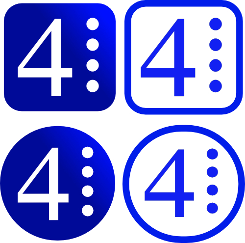
When we talk about updated or modern icons, in terms of design, are we looking for this kind of thing where the icons share a frame shape and size, like on Mac OS currently and I believe on some Linux distro?
Very rough-and-ready mockup of a Pipedream 4 icon as an illustration. |
|
|
The problem is, of course, is it looks precisely like copying another OS. Could just modernise the icons without adding borders… |
|
|
If the icons-with-borders look was the one people wanted, it is then quite easy to modernise the RISC OS cog logo:
|
|
|
Now, how does that look 34×34 pixels, 256 colours? That’s the baseline. |
|
|
Yes, usually the elements (at least found so far) are: 1) Frames This should already cover most of the Themes, I need to double check, but right now I am tired and have some fever, hope I didn’t catch any nasty stuff this week. |
|
|
Yes, hence analysing existsing icons and just adapt them basically, that should probably be enough to keep the original feeling in a more modern way. But again, as Gavin mentioned well, only folks into CG knows this stuff. But if nobody does it, someone has to. |
|
|
I can scale them down in a moment, but what’s with the 256 colours? Is that all that is available for icons, or are you referring to the fact some screen modes have only 256 colours? If the latter, then I’d take the view that a line has to be drawn at some point. You can pick up a new Raspberry Pi for about fifty quid again now, so you’d have to be in pretty bad dire straits not to be able to afford to upgrade from an ancient RiscPC and it’s infuriating VRAM limitations. |
|
|
Yes, BUT, remember if we ask all users, in 20 users we’ll get 20 different responses (believe me, I have collected requirements here and it’s a job on its own), the feeling is people have extremely strong opinions on what’s right or wrong, I think the choice should be more on who understands CG than on the average user. Nothing wrong with collecting requirements (I still do), but you gotta apply a congruent style in order for the theme to look coesive. |
|
|
That is the base requirement at the moment and for RO 5, for older ROs there might still be 16 colours too, but let’s focus on RO 5 for now. The other thing is, we also have !Sprites, !Sprites21, !Sprites22, 4Sprites and 5Sprites (for alpha blending). Themes may not require all of them, however the traditional !SpritesXY are a “must” |
|
|
I shouldn’t have joined in this conversation as now my curiosity is getting the better of me. I shall be digging around looking at icons on RISC OS for the rest of the weekend instead of finishing the decorating. |
|
|
If you need a list of ALL the icons that needs re-drawing for each theme have a look at the !ThemeDefs you already have in your Boot:Resources.!ThemeDefs |
|
|
I guess whoever sits down and creates icons or themes is the one who gets to decide. If the traditional Acorn icons and GUI look are always available then nobody is being forced to change.
Absolutely. |
|
|
Maybe one day, I mean it’s a lot of work, but yes it can be done and should be done at some point. What needs to be changed is not just the Filer, Launchpad (kinda is almost ready) and Pinboard. It’s the Sprite API, because, otherwise Applications will still use the old Sprites instead of a Vector based approach, so it’s something we probably want to discuss with ROOL (and ROD). But yes it’s very much needed, try to have a Pi running a very high resolution screen ;) |
|
|
Indeed |
|
|
Is it a base requirement because people might still run with 256 colours, or is it because the OS demands it?
RISC OS 5 on at least the Iyonix seems a sensible place to draw the line to me. A limitation of 16 colours – hell even 256 colours – means no way of coming up with a modern-looking set of icons. If I one day managed to write a program I wouldn’t, for example, even consider the legacy hardware from before the Iyonix. It’s not reasonable to be expected to support hardware that is now quite literally decades old. Not in my opinion, anyway. It’s only fifty quid for a new Raspberry Pi, after all.
Good to know. Thanks. |
|
|
@ Gavin
Thanks a lot man, I really appreciate your words. But communication is key here, if you remember at the beginning of the DME project people were not understanding what would have happened and I started to get feedback that sounded to me weird (aka why do people don’t want to make RISC OS better?). Then they started to see what it actually is and now I get allot of great feedback and people wanting it like “yesterday”. That is indeed a problem with communication. How many times I had “clashes” with Rick, while pretty much saying the same thing? Clearly, I was saying it not in the right way, I mean it’s hard to believe Rick was the one saying it wrong! ;) |
|
|
Tell me about it! lol But we have a new wave of folks using the old systems (have a look at eBay prices!), pretty much more than they use RO 5. Why? is beyond me (I mean, I still have a full rack here with old Acorn hardware still in perfect working order, but that’s just because I love it and at this point is being used only for code testing purposes). I think Clive expressed this really well and in many situations, however, for someone making Themes, especially if they wish their stuff to be used by the majority of the userbase, considering RO 4 and 6 at the very minimal is probably a good idea. However, again this can be something that a theme designer decide. My Theme Manager works (or should work) from RO 3.10 all the way up to 5, so the “platform” allows a Theme Designer to chose what they wish to support. |
|
|
Damn it. I’ve just lost the cog document. Here are a couple of Pipedream icons at 34 pixel width. They are not perfectly square so the height is greater than 34 pixels, but there are just rough concepts:
|
|
|
looks good to me! |
|
|
It’s great if the Theme Manager does support all those variations of RISC OS, of course. For icons, however, I think people who like the retro hardware will simply have to accept that icons that look great in 16 millions colours will look slightly less great in 16 or 256. They must be used to it anyway because already everything looks worse, and certainly browsing the Web etc must be horrendous. That’s only my opinion from the point of view of what I’d think if I sat down and made a full set of icons. |
|
|
Thank you. I’m happy with them at that extremely small size. |


