Bounty proposal: Paint
Pages: 1 ... 12 13 14 15 16 17 18 19 20 21 22 23 24 25 26 27
|
|
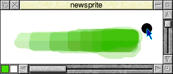
Argh! Three steps forward, two steps back. I’ve just realised a big limitation of my technique for brush opacity. This is the technique I mentioned in the last few posts where the current brush stroke is drawn onto a separate, translucent layer that’s drawn over the underlying sprite (using alpha blending or blend tables on older OSes) to avoid interference patterns. The problem occurs when the current screen mode has a higher number of colours than the sprite being edited. Because the translucent layer with the brush stroke is plotted to the screen, not the sprite, RISC OS does a nicer job of blending it, using the higher number of colours available for the screen mode, than is possible when the layer actually gets merged onto the sprite. To put it simply, it displays the new brush stroke using colours that the sprite can’t have. The effect is extremely noticeable on sprites with 256 colours or less and somewhat noticeable on 4k, 32k and 64k sprites. The way to fix it could be rendering the new brush stroke to yet another intermediate sprite instead of directly to the screen, but considering users with older or less capable machines may be more likely to make more use of the modes with fewer colours, I’m not sure trebling the memory requirements is the way to go (note Undo / Redo will probably add yet another copy of the sprite). For the time being it might therefore be necessary to disable the Opacity feature for sprites with fewer than 4k colours.
The above screenshot shows the colour discrepancy when painting on a 4k image in a 16M colour mode. The bottom half of the sprite window was wiped over to force a redraw of that section of the merged, 4k colour, image. The top half shows where the translucent brush strokes were instead blended using 16 million colours. |
|
|
I may not be understanding the process here, but I assume you’re painting the brush to the screen while the mouse button is held down, and then when the mouse button is released, it’s merged into the sprite (and the sprite’s redrawn)? So the effect where the sprite has too many colours is only for the duration of the drag. If so, then is it a big problem? If I’m editing a 256-colour or 4K sprite, say, then translucency is always going to be a bit of a rough-and-ready thing. I wonder how much of an issue it would be to have a ‘jump’ from smooth opacity to a more granular final effect when you release the drag, in those colour depths. After all, if you care about fidelity, you’re probably working in 16M already. Obviously it’s difficult to know, without seeing it in action. Would another possible solution be to force a redraw every so often, so that, if you have a long drag, every now and then Paint just silently updates the underlying sprite, so that what you’re seeing and what’s actually happening to the sprite are never too far apart? |
|
|
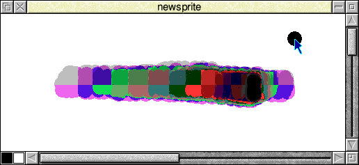
I assume you’re painting the brush to the screen while the mouse button is held down, and then when the mouse button is released, it’s merged into the sprite (and the sprite’s redrawn)? So the effect where the sprite has too many colours is only for the duration of the drag. Correct. then is it a big problem?I think we can live with it for 4k or better sprites. I will need to force a redraw of the sprite window after the merge which may cause a minor slowdown when the mouse button is released, unless I start tracking the bounding box of the brush stroke (I think OS_ChangedBox will just think the entire sprite changed). If I’m editing a 256-colour or 4K sprite, say, then translucency is always going to be a bit of a rough-and-ready thing. Well, at 256 colours it just looks awful! The below screenshot was made painting repeatedly in black at 25% opacity (again I’ve wiped over the bottom of the window to force that half of the brush stroke to be merged into the 256 colour sprite).
Unless there’s some unforeseen bug in how I’m setting up the translation tables or blend tables, it seems like ColourTrans settles for wild variations in hue to achieve the blend in 256 colours. It looks lovely with a 256 greyscale sprite though, so I’d like to enable opacity specifically for 256 greys as well as 4k and up. |
|
|
Would another possible solution be to force a redraw every so often, so that, if you have a long drag, every now and then Paint just silently updates the underlying sprite, so that what you’re seeing and what’s actually happening to the sprite are never too far apart? No, doing that will reintroduce the interference patterns, because you’d be breaking the brush stroke into sections, so where a new section overlapped an older one the opacity will combine. I suppose to get around that they could be rectangular areas with no overlap but that would be a fair bit of extra code to avoid an effect that’s quite subtle on 4k colour sprites and up. Edit: To properly tessellate you might end up updating areas of a single pixel in the worse case (very slow) and they’d all have to be tracked to know if the user is painting back over any rectangles that were already plotted. A better way around it might be keeping a list of brush sprite plot coordinates for the active brush stroke and masking the old plots out from the newest plot on the temporary sprite before merging it with the base image. When I finish the Undo/Redo feature I want to write some functions that check the user’s available RAM, so on a machine with plenty of memory we could eventually solve it by rendering the current brush stroke onto an additional working copy of the sprite (as mentioned earlier). That could also pave the way for flicker-free painting, but I’m not sure any of that will make it into this bounty! |
|
|
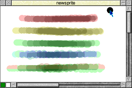
Regarding the glitches in the 256 colour screenshot above, that was a 256 colour sprite with no palette. I’ve just discovered that when it’s created with a colour palette, the blended hues look a lot closer to the selected colour. Maybe translucent sprite plotting requires a palette to be present for <= 256 colours?
There are still a few oddities, like the green colour 64 looks a reddish-orange at low opacity when drawn in a 16M colour screen mode before the merge happens (but green at higher opacities). It changes into the correct green when the layer is merged into the sprite. This effect can be seen on the bottom brush stroke on the above screenshot. |
|
|
Regarding the glitches in the 256 colour screenshot above, that was a 256 colour sprite with no palette. I’ve just discovered that when it’s created with a colour palette, the blended hues look a lot closer to the selected colour. Maybe translucent sprite plotting requires a palette to be present for <= 256 colours? To answer my own question, after a lot of experimentation, it certainly seems that translucent sprite plotting using the BlendTable or InverseTable generated by SpriteExtend won’t work in a true colour screen mode when plotting onto a 256 colour sprite, unless that destination sprite has a palette. The brush stroke colours blend correctly onto the screen now, so it seems to have no problem blending from a 256 colour paletted source to the 16M colour screen, but once I try to merge the brush strokes onto the 256 colour, non-palletted sprite, all the colours come out wrong. I’ve spent a long while fiddling with the sprite translation tables, but as soon as I disable translucency so the brush strokes are fully opaque, the colours are all correct, so it does seem to be going wrong at the blending stage (I’m not sure if I generate my own BlendTable or InverseTable whether SpriteExtend would pick it up or if it always makes its own). As it works well when the 256 colour sprite does have a palette, I’m thinking of popping up a message box offering to add a palette to the sprite if the user tries to set less than 255 opacity, which seems to me to be a better option than just not allowing the feature on those 256 colour sprites. |
|
|
I’ve tried this with my own sprite plotting routines. I get the same dubious results as you when I switch output to a 256-colour sprite without a palette, and plot in to it with translucency. If I change to a 256-colour screen mode and re-run the code I get correct results. Under RO 4.39 I get correct results regardless of the screen mode. I’ve found the problem: when output is switched to a sprite without a palette ColourTrans uses the palette of the current screen mode, which isn’t very helpful if the current mode has a different BPP to the sprite. The ColourTrans source has a switch, defaultpalettes, which makes it use the default palette instead, but the comments say it caused problems with “PC Stimulator” and Acorn DTP. According to ROL’s changelogs they enabled defaultpalettes in June 2003. Perhaps it’s time to enable it in RO5 too? Any programs that are broken by this presumably aren’t 32-bit compatible anyway (and probably don’t work right in 16M colour modes either). You’d still have the problem that the default palettes for modes with 16 or fewer colours are the ones the BBC Micro used, whereas Paint defaults to the desktop palettes for those modes. Drawing with translucency wouldn’t be a lot of use in those modes anyway though. |
|
|
How does the DragASprite thing work? IIRC, it looks pretty convincing when you drag a desktop icon from the filer around the desktop in a 256 colour screen mode. |
|
|
Thanks Edward! I’ve been poking at this for hours so it’s very nice to know it’s not anything I’d got wrong, at least! How does the DragASprite thing work? IIRC, it looks pretty convincing when you drag a desktop icon from the filer around the desktop in a 256 colour screen mode. I’m not sure, but anything that’s drawing over the screen shouldn’t have the same problem. The issue we’re having is when plotting translucently into a sprite (with no palette and a different number of colours to the screen). |
|
|
Oh, I see! What’s the reason for the intermediate sprite? |
|
|
Oh, I see! What’s the reason for the intermediate sprite? It’s described in this post. If you paint translucently directly onto the sprite, it makes ugly interference patterns where the edges of the brush sprite plots overlap one another. |
|
|
Ahh, I see. Perhaps that’s just what we should expect, and to make it look nice you’d select a brush sprite that’s not “Circle”, but basically a radial graduated fill? |
|
|
Yes I would quite like to make some brushes with soft edges when I add support for alpha mask sprites but I don’t think they could completely eliminate the effect. |
|
|
The ColourTrans source has a switch, defaultpalettes, which makes it use the default palette instead, but the comments say it caused problems with “PC Stimulator” and Acorn DTP. According to ROL’s changelogs they enabled defaultpalettes in June 2003. Perhaps it’s time to enable it in RO5 too? It would certainly make the behaviour a bit more logical and also more efficient (what’s the point in adding a palette to the sprite to make blending work, when that palette already exists in memory). Any programs that are broken by this presumably aren’t 32-bit compatible anyway (and probably don’t work right in 16M colour modes either). It would be nice ideally if there was a flag to indicate whether to use a sprite’s default palette, the screen mode’s palette or even the desktop palette, or, even better, some way to pass the address of the palette to use to plot the non-paletted sprite. |
|
|
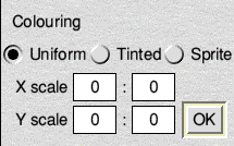
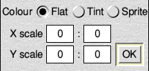
As one of the new brush features is tinting the brush sprite by the currently selected colour when Shape is unticked, I’ve been thinking about replacing the Shape tick box with radio buttons.
The above layout takes up a very large amount of the tool window’s vertical space. I think the below layout fits better:
To squeeze the radio buttons in on the second layout, it was necessary to make the labels from separate icons, so they’d need click events coded to activate their buttons. What do you think of these controls? Does the terminology make any sense? If they’re too confusing, I can just keep the Shape tick box instead and use the unmodified sprite colours when black or white are selected (I wanted to do it just when white’s selected, but black is the default colour in Paint so I think that would be too confusing). |
|
|
I like the second layout best, though if the dimensions are that tight then you might end up with overrunning text in a different desktop font. Do you actually need to have the ‘Colour’ label? Or, if so, would ‘Style’ work just as well, and give you more space? While we’re on the subject of the layout here, the writable fields and default button for the scale controls steal the input focus, and require switching to the keyboard to update the brush size. What do you think about replacing them with standard number fields (ie, sunken icons with up and down arrows), and a non-default button ‘Set’ to set the brush size? That would enable everything to be controlled by the mouse, which is helpful when editing sprites. |
|
|
I’ll echo Chris’s comment about it being a bit cramped. It’d probably be better to replace the radio buttons with a popup menu. That way there should be adequate space for different font styles or languages. |
|
|
I like the idea of removing the `Colour` label. How about:
Or:
I agree that’s a more usable interface than the writable icons. However, I think I’d make it take effect immediately, rather than needing a “Set” button. |
|
|
Ooh, yeah popup menu is best! |
|
|
Yeah I guess a popup menu could solve it. It’s a shame I can’t think of three short words that would express what it’s doing without the extra label, but, as you say, other languages might need longer words as well. While we’re on the subject of the layout here, the writable fields and default button for the scale controls steal the input focus, and require switching to the keyboard to update the brush size. What do you think about replacing them with standard number fields (ie, sunken icons with up and down arrows), and a non-default button ‘Set’ to set the brush size? I do like the idea of having numeric up / down arrows to change the scales with the mouse but I don’t agree with having an additional button to apply a change to the scale (or did you mean instead of the OK button?). It’s already slightly clunky having the OK button to change the brush (when none of the other tools have one), although that needs to stay there due to the way the brush creation code works (although the situation is slightly improved with my brush selection improvements; hopefully you’ll get a look at those soon). I did see ROL renamed it to something like “Set Brush”. the writable fields and default button for the scale controls steal the input focus I still don’t completely understand why it bothers you that it takes the focus. I suppose it’s a little strange that you have to lay down some paint in the sprite window to use its keyboard shortcuts after the tool window takes the focus (it was preferable to requiring the extra left click to resume painting after changing tools). I actually like being able to keep pressing Return to apply brush settings, with the default button. It’s certainly sped up my testing. |
|
|
It’s a shame I can’t think of three short words [X] Brush [ ] Stamp [ ] Tint Ah sorry Michael, your post wasn’t there when I started writing mine! That sort of works but I’m not sure “Brush” fully conveys what it’s doing. After all, some brush sprites might look more like a brush in Tint mode (I’m not sure yet. Maybe if alpha masks work in “Brush” mode it will be OK). How about: [X] Shape [ ] Stamp [ ] Tint..? Ooh, yeah popup menu is best! Shame it takes longer to code. If only we had them in RISC_OSLib! |
|
|
Andy S wrote:
Don’t forget how much longer some words are in other languages, particularly German. |
|
|
Yeah, the latter :) Although maybe having a confirmation button at all becomes redundant, if the switch to number fields made it easy to bounds-check ratios? I don’t know.
I suppose it comes down to a view on what input focus is, and when it’s helpful. As I understand it (and happy to be corrected by those who know better), the basic idea is that the input focus is a property of editor windows. Most importantly, it gives a visual indication of where keypresses will be acted on. But it’s also useful to act as a reminder of which window is active – the one the user is dealing with, and where they expect things to happen. On RISC OS, which is quite liberal with sticking windows all over the screen, that’s really handy. Obviously dialogue boxes take the focus when they’re invoked, but once they’re done with, it’s promptly returned to the editor window that had it before. Toolboxes, to my mind, are a different beast. Paint’s unattached one sits around permanently, so if it captures the focus, the nominated ‘active’ window is lost, and the user has to explicitly put it back at some stage. And that’s not a massive problem, usually, except that Paint has been written in such a way that clicks in a Sprite window will always apply the currently selected tool, even if the window doesn’t have the focus, leading to the potential ‘click of surprise’ problem. As you say, it is odd that you there’s no way to make a Sprite window active again (and hence make use all the useful keypress shortcuts that have been added to the app) without actually painting with a tool first. ArtWorks, to my mind, has the most rigorous and logical system. Its attached toolbars don’t steal the focus, and the first click on an editor window without the focus does nothing except ‘activate’ it. I’m certainly not suggesting Paint is rejigged completely to follow that model, only that where it’s possible without much trouble to get rid of, say, writeable fields in the toolbox (and hence stop it nicking the focus), it seems worth doing. Others may disagree, of course, or think it’s a lot of fuss about nothing :) I do take your point about Return being a handy shortcut to set the brush settings, though I now wonder whether it’d be better to have the interface do the work here, and just get rid of the Set/OK button entirely (as suggested above). |
|
|
Toolboxes, to my mind, are a different beast. Paint’s unattached one sits around permanently, so if it captures the focus, the nominated ‘active’ window is lost, and the user has to explicitly put it back at some stage. Would it be more acceptable if the tool window just stopped taking the focus when a user clicks a tool button? That way, if you clicked on, for example, the text tool, it wouldn’t put the caret in the text box unless you click in it. I’m not sure if that would be against the Style guide advice or not. Thinking about it, it would probably be a step backwards, as the red caret provides a visual prompt of where to begin typing, and it’s easier for an inexperienced user to use something like the text tool in particular, if they can just click the tool button and begin typing. I did notice the dialogue to create a new sprite doesn’t seem to grab the focus at the moment. |
|
|
Although maybe having a confirmation button at all becomes redundant, if the switch to number fields made it easy to bounds-check ratios? I don’t know. I now wonder whether it’d be better to have the interface do the work here, and just get rid of the Set/OK button entirely (as suggested above). As I say, although the OK button isn’t the nicest thing from a user interface point of view, it’s necessary because of the way the brushes are made in the code. Any changes made on the Shape option, the sprite Name field (which I know you don’t like) and the size fields won’t take effect until OK is clicked, at which point various things may be set up in memory, especially if it’s a new brush sprite, such as building colour translation tables and, now in some cases, setting up a ColourTrans transfer function to tint the plotted sprite. The opacity as well won’t be able to take effect until OK is clicked because the code has to check how it will work with the specified brush sprite. Even if we do squeeze numeric up/down arrows on for the brush sizes, I’d personally like the option to type the numbers in, as I wouldn’t want to click the up arrow sixteen times for a 16:1 scale. |
Pages: 1 ... 12 13 14 15 16 17 18 19 20 21 22 23 24 25 26 27
